Famous brand logos: origin and meaning. What do the logos and names of world famous brands mean World clothing brands logos and names
Every day a person comes across hundreds of logos. They are so familiar that few people think what they mean. But in fact, even the simplest logos often take months and millions of dollars to create, and almost every one of them has some subtext. In our review of 10 famous logos with a decoding of their meaning.
1. Fedex

The logo of an American logistics company consists of 2 parts: the inscription "Fed" in purple and "Ex" in orange. It seems to be nothing special, so why did such a modest logo win dozens of awards? The answer is simple - the space between the letters "Ex" forms an arrow, which on a subconscious level is associated with the speed and professionalism of the company.
2. McDonald's

Most people think that the logo of the McDonalds fast food restaurant chain is nothing more than the first letter of the company's name, painted in golden color. However, fans of Freud's theory argue that this form of the letter evokes associations with a nursing mother's breast.
3. Museum of London

The Museum of London is dedicated to the history of this city from the time of its founding to the present day. In 2010, the museum management decided to update its image in order to become more attractive to a younger audience. The new logo was made in bright colors and is sure to attract attention. At first glance, the new logo immediately presents a map of London. And each of the colored contours is the boundaries of the city limits of the British capital in different historical eras.
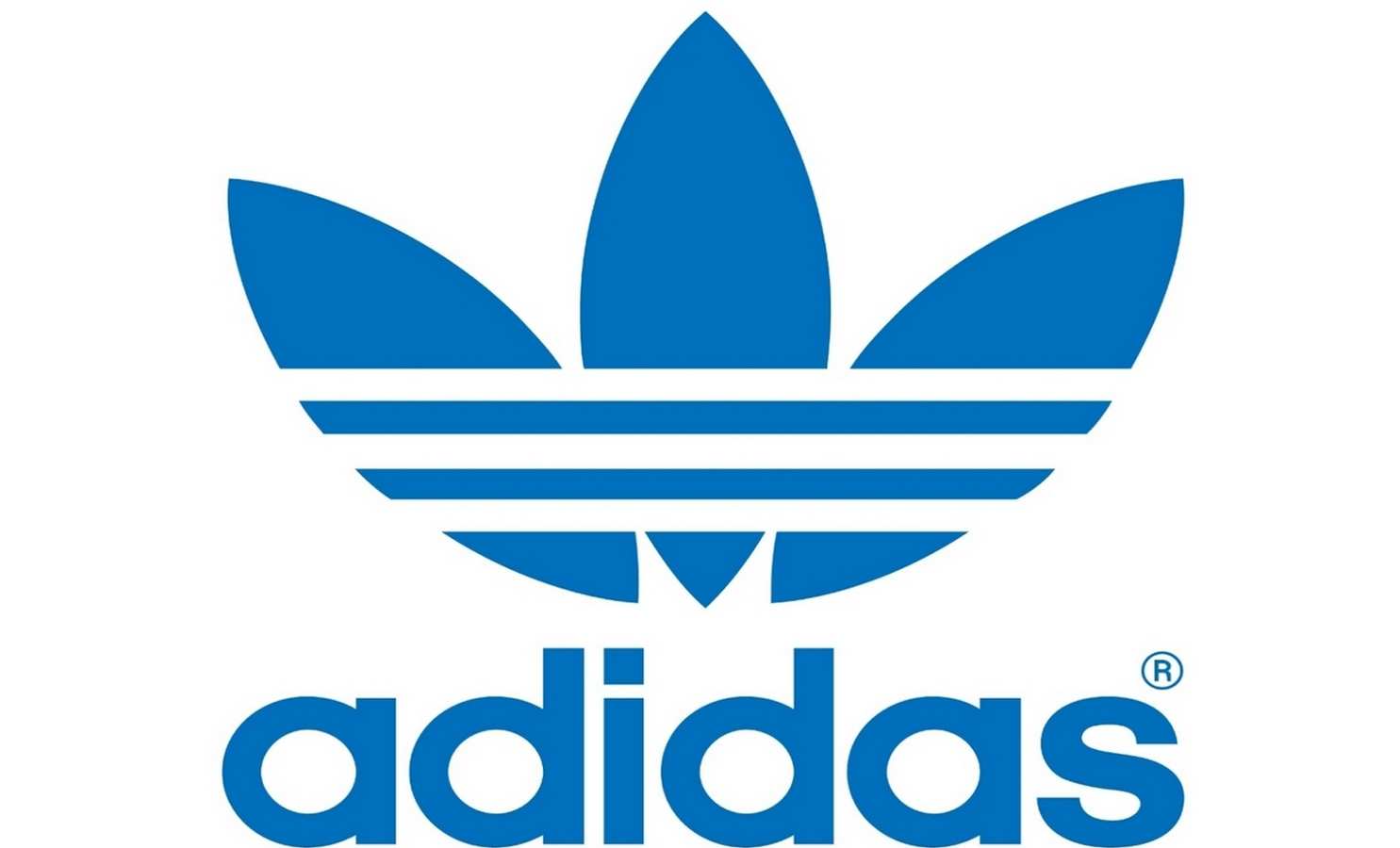
4. Adidas

The name of the famous manufacturer of sportswear and accessories arose from a combination of the first and last name of its founder, Adolf Dassler. Over the 66 years of the company's existence, its logo has changed several times, but it has always had three stripes. Today, the logo has three slanted stripes in the shape of a triangle, which symbolizes the mountain. This metaphor means conquering new peaks.
5.Mitsubishi

Mitsubishi was founded in 1873 as a result of the merger of two shipbuilding companies. The company's logo appeared by combining the coats of arms of its creators - the three-leaf crest of the Tosa clan and three diamonds of the Iwasaki family. The three diamonds symbolize reliability, integrity and success, while the red represents trust and attracts customers to the brand.
7. Google

The Google logo looks very simple - just a regular inscription, the letters in which have different colors. In fact, when creating the Google logo, the designers wanted to capture a sense of the company's "rebellious spirit". The secret of the logo lies in the colors of the letters: the primary colors (blue, yellow and orange) are suddenly interrupted by a green letter that is out of the scheme. So Google decided to highlight its non-standard and unwillingness to play by the rules.
7. Animal Planet

Previously, the Animal Planet logo featured an elephant stretching its trunk towards a miniature Earth. However, in 2008 the channel was rebranded in order to increase its appeal to a wide audience. The channel had to get rid of long and boring documentaries and move on to captivating reports. The new logo, as Animal Planet explained, should represent instincts, the jungle and primal emotions. Quite a lot of emotion for an emblem that had one letter upside down.
8. NBC

It's no secret that the NBC logo symbolizes a peacock, but few people know why this is so. It was actually a marketing gimmick to get people to buy color TVs. At the time the logo was created, NBC was owned by the electronics company Radio Corporation of America (RCA). RCA wanted to show the public that the relatively high price of a TV was entirely due to the ability to view pictures in color.
9. Amazon

At first glance, the Amazon.com logo is very simple - the name is in bold black with a curved yellow arrow underneath. But what does this arrow symbolize? First, it represents the smile of a satisfied customer. And secondly, the yellow arrow goes from the letter "A" (the first letter in the Latin alphabet) to the letter "Z" (the last letter of the alphabet), which symbolizes the diversity of Amazon products.
10. Pepsi

The Pepsi logo is a simple circle with the top half red and the bottom half blue, with a wavy white line between them. At first glance, these are the colors of the American flag. But in fact, Pepsi has spent hundreds of millions on its current logo. The branding agency that designed the logo for Pepsi released a 27-page report outlining the many meanings behind the logo. It symbolizes the Earth's magnetic field, feng shui, Pythagoras, geodynamics, probability theory, and more.
Each of us sees these logos every day, but not everyone understands what secret meaning lies in them.
So, it's time to expose the logos that flash before our eyes every day!
If you think that the logo of the Korean titan Hyundai symbolizes the first letter of its name, then you are deeply mistaken! H is a symbolic image of a client and a customer shaking hands.
Who hasn't heard of the Adidas brand? It was formed in honor of its founder - Adolf Dassler. The logo was endlessly changed, leaving only one element intact - the three stripes. The modern logo is depicted in the form of a mountain. This is a symbol of the obstacles that every athlete will certainly face.
Renowned designer Rob Yanov, who worked on the Apple logo, purchased a bag of apples and drew them in a frenzy, trying to keep the shapes as simple as possible. A piece of apple was bitten off as an experiment. Oddly enough, the word byte is translated as a bite. What a coincidence!

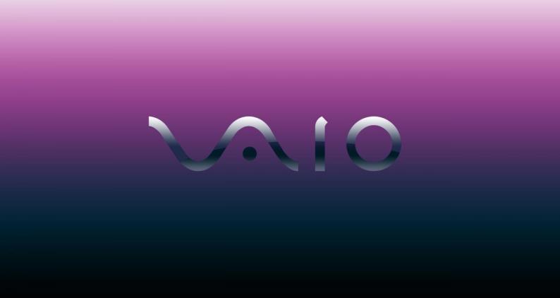
Sony Vaio - the owner of an outstanding logo. Its first two letters are a wave that represents an analog signal, the last two letters symbolize a digital signal.
There is nothing supernatural about the Amazon logo. The bright yellow arrow is the customer's smile, because Amazon employees wish their customers happiness. A smile arrow combines two letters A and Z. This suggests that you can buy everything on the portal - from A to Z!

Baskin Robbins has a bright and appetizing logo. If you look closely at the pink part of the picture, you can see the number 31. This is the number of flavors of ice cream that customers can try.

Many people believe that the Toyota logo is a stylized head of a cowboy wearing a hat. But everything is much more complicated. In fact, it depicts the eye of a needle and a thread threaded through it. The thing is that before the company was engaged in looms. There is one more subtle nuance - if you put all the elements of the logo together, you will get the name of the company.

Continental manufactures car tires. One of them became the two capital letters of the logo. If you look closely, you can see the drawing of the wheel in perspective.

The Formula 1 logo literally screams about speed. An attentive viewer will notice the number 1 between the letter F and the red stripes.

Do you like to watch interesting videos and add them to your online board? The inventors of Pinterest propose to “pin” videos using a virtual needle, which is the letter P in the logo.

It's hard to believe, but Beats deciphers its logo as a music lover in headphones. The logo contains two elements - the letter B and a red circle ... Simple and incomprehensible!

Toblerone is a well-known global manufacturer of delicious chocolate. This brand is inextricably linked with the city of bears Bern. That is why the Toblerone logo depicts a bear standing on its hind legs.

BMW began its history in the aviation industry, so the logo says so. Some believe that in the center of the logo is a moving propeller with blades. But no, it's very simple, it's just a part of the Bavarian flag.

In the center of the LG logo is a smiling man. Because the company's employees treat their customers like human beings, which they want to emphasize. Some skeptics believe that the company logo is based on the character of the Pac-Man game.

Evernote employees believe that some animals remember information as well as humans. That is why they put the logo of an elephant on their logo, which has a slightly bent ear, like paper. With such an elephant - a note from Evernote, the user will not forget anything!

The hidden meaning of the Coca-Cola company is amazing! To boost sales in Denmark, they placed the Danish flag between the O and L.
Logos with the name of the company are their most common type, according to statistics, up to 70% of all modern logos belong to them. This is not surprising, because they perform a dual function, helping the audience to get acquainted not only with the symbols, but also with the brand name. This combination makes these signs as effective as possible, but still requires high professionalism from the designer - for a harmonious combination of pictures and text with each other. How to create a high-quality logo and, at the same time, come up with an original name for your business? Read this article!
Company name - why is it so important?
Among the seafarers of the past centuries, it was not in vain that the saying went - "whatever you call a ship, so it will sail." This rule still applies today, so it is recommended to choose the name of your company very carefully before you send it to sail the ocean of business. It should not only be original (which is not easy in itself), but also optimally match your specialization.
An equally important factor is the memorability of this word or phrase, a person will not “puzzle his head” for a long time, remembering the name of this or that company. In addition, the name must be attractive, pleasant to hear, and evoke positive associations in the audience. Most new customers will begin their acquaintance with your products or services with their brand, and are unlikely to be willing to pay money for something that does not inspire confidence in them.
If you have not been able to decide on how to beautifully and accurately name your company, then we will be happy to help you in this matter. We invite you to view the list free names for brands below, and if you wish, you can use each of them without any restrictions. We specially designed them. The only thing is, we cannot guarantee that at the time you read this article, someone has not used the name before.
Examples of free company names in English
td (padding: 1.5em;)
| Caratch | Caromni | Stepegg | Caraipi |
| Netelectra | cafesea | cafefire | wood tap |
| Reelectra | cafejar | Cafemirror | Electra |
| The Car Group | bestofstep | engine cafe | Nuelectra |
| carer | soft dude | Woodcell | Targetwood |
| Cardecu | Stephq | sweetwiki | Hubwood |
| wow step | Reget | Telesweet | Woodoffers |
| Steploop | carroch | cabinsoft | Electraall |
| Carceag | ranch soft | Softjunky | Woodrace |
| titanic power | Trycup | Goldalpha | Zippy high |
| Leaderhigh | Herowild | Timeneo | Vipever |
| Funvita | Nextwave fashion | Safetyvita | Vitaprofessional |
| Surface fashion | Hugecake | Morenova | Joyprofessional |
| Availgold | Primal team | Winnerelite | rightelite |
| Meelite | Dayneo | Novagenius | Onlynova |
| firstwiz | Pitchlook | Maximateam | Royalprimary |
Another effective way to get a name for your new brand is to use special . Today, there are dozens of similar services on the Internet, both in English and in Russian. In the next section of our article, we will consider the most famous of them.
Popular brand name generators
Below we have listed the popular services that will help you choose the best name for your future company for free, as well as check if it is free for it. So, these include:
The world-famous online shopping platform also offers users a convenient tool for choosing a unique name for your company. It is important that the Shopify generator not only looks for original combinations of phrases (based on the subject of your business), but also checks for free domain names for them;

Another specialized service designed primarily for start-ups - young innovative companies. Allows you to select suitable titles and domain names for one or more keywords. You will then be presented with a wide range of results sorted into a number of categories (general, similar, new, funny, combined, SEO, etc.);

A simple but functional site will help you find several tens of thousands of possible combinations of company names in a matter of seconds, based on the entered keywords. The service allows you to sort the results by topics (short, business, technology, modern, etc.), quickly check the domain name for each, and save your favorite options to your favorites.
Once you have chosen the best name for your business, it's time to place it on a bright, original and memorable logo.
How to create a logo with a company name?
Every entrepreneur faces a lot of difficulties and problems during the time, especially if this is your first business. During the launch of an enterprise, a number of issues have to be addressed - from choosing a relevant niche to obtaining permits and finding reliable business partners.
Particular attention should be paid to the positioning of your brand, this task should be done immediately after selecting its name. So, if you have already found the perfect name for the company, then we recommend moving on to developing a personal logo,. This sequence of actions will help you save your time and money on ordering naming and corporate identity.
![]()
After all, corporate identity is the most important component of promoting any business, with its help you can create a visual image of your company, make it as recognizable as possible and stand out noticeably from competitors.
In addition, a unique corporate identity visualizes corporate ideas and values, improves the image and strengthens brand trust, and also increases the effectiveness of any advertising campaigns.
In addition to the logo and name (which are considered its basis), modern corporate identity includes a lot of other components. In particular, these are sets of colors and fonts, as well as a set of printing with business cards, letterheads, calendars, envelopes and other materials designed in a single style.

Large companies spend huge budgets on the development of their logos and corporate identity, ordering these services from well-known design bureaus. However, novice entrepreneurs often cannot allocate any serious funds for these products, so many have to create a logo on their own using graphic editors.
![]()
However, there is another effective way to create a quality logo with a name, for which you do not need to spend a lot of money or have design skills. To be more precise, Logaster offers visitors several options at once - you can use the logos prepared by us or design them yourself using the powerful functionality of our service. To do this, just enter the name of the brand and select its theme, then you will be offered dozens of possible options, each of which can be quickly edited (font, color, icon, text) and downloaded to your computer in one of the appropriate formats (PNG, PDF, JPEG , SVG).
As you can see, company name logos have a wide range of benefits and are a solid foundation for the development of corporate identity and your brand as a whole. Thanks to this, they confidently take the place of the most popular and sought after, among all existing types of logos.
Examples of logos created on our website


As you can see, company name logos have a wide range of benefits and are a solid foundation for the development of corporate identity and your brand as a whole. Thanks to this, they confidently take the place of the most popular and sought after, among all existing types of logos. We hope that our article has given you some tips on how to find the perfect dream logo for your project, which will help it achieve success and audience recognition.
A logo is essentially a visual representation of a company. Think of the golden arches of Macdonald's or the swoosh of Nike - these impressive logos have embodied two of the largest empires under their banners. However, many companies still skimp on developing this key part of building the corporate ideal. A good memorable logo significantly increases the growth and loyalty of customers, forms the right impression with business partners,
There are 3 types of logos:
- Repeating infinity elements. For example, the fundamental power of the logos of IBM, Microsoft and Sony is created by intersecting elements, which makes the symbols of firms distinctive.
- There are logos that literally illustrate what a company produces or provides, for example, painting houses often use an illustration of a brush or paints in a logo.
- Use of abstract graphic symbols. An example is Nike. Over time, the image of the brand name has become for consumers a reminder of the company in any situation.
Consider the most popular logos of famous clothing and footwear brands.
Nike
The logo of the well-known company is represented by the popular signature Swoosh, which identifies the wing of the Greek goddess Victoria (the Greek name Victoria means “victory”). The logo project was launched in 1971 by Caroline Davidson, a graphic designer and student at the University of Oregon. This project was suggested to Caroline by Philip Knight, one of the founders of the company. Knight didn't particularly like Caroline's suggestion, but he was confident that the logo would work for him in the future. And, as we see, he was not mistaken in the calculations. Later, as the Nike brand rose to international heights, Philip gave Davidson a thank you gift of a Swoosh diamond ring and a huge amount of sportswear and shoes from the company's warehouse.
Adidas
The Adidas brand was created after the collapse of his father's company, which was called Gebrüder Dassler Schuhfabrik. Initially, the name of the company sounded like Addas - an abbreviation of the initial letters of the name of the founder of the company. However, a few months later, Addas was changed to Adidas (the founder was called Adi among friends).
The signature three stripes featured on the logo were acquired from the Finnish sports company Karhu in 1950, and today it is the style of the firm that is included in the most popular logos of famous brands. By the way, the stripes symbolized the popularity of the company on three continents.

Puma
Rudolf Dassler, brother of Adolf Dassler, in turn, founded the Puma brand. The first version of the company's logo differs from the one we know now - the original name of the company sounded like "Ruda" (from the name of the founder of Rudolf, Rudoo). According to one version, the first version of the logo was designed by Rudolf himself, and in the 60s of the 20th century. the symbol acquired the familiar outlines of Puma.

Gucci
Gucci is the brainchild of Guccio Gucci, who laid the foundations of the now famous brand in 1921 in Florence. One of his six children and became the designer of the famous logo in 1933. Today, the Gucci symbol is chicly included in the logos of famous clothing and footwear brands, as it occupies one of the first places in terms of recognition.
A feature of the symbol was the overlapping letters G. However, these are not only letters, this is a symbol of two stirrups - the legacy of the Guccio Gucci brand, which sold accessories for horses.

Givenchy
Givenchy is a fashion brand founded in 1952 by Hubert James Marcel Tuffin de Givenchy. Today, the company also produces perfumes, clothing and jewelry. The logos of famous brands have been replenished with another popular symbol of the fashion house.
The logo design is quite simple, but attractive and mesmerizing at the same time. It is a four "G", occupying the entire area. The Givenchy logo is reminiscent of ornate Celtic jewelry.

Levi Strauss & Co
Levi Strauss & Co. (LS & CO) was founded in 1853 when Levi Strauss moved from Franconia to San Francisco to promote the West Coast branch of his brothers' haberdashery business. Already in the 1870s, the company launched mass sales of denim overalls, which were successfully dispersed among buyers.
It is worth noting that jeans in the form that is known to the modern man in the street began to be produced only after 1920. It is noteworthy that the original logo of the company appeared in 1886 and was a two horses tearing jeans into different parts. Logos of well-known history of their creation, as a rule, are overgrown with legends. Thus, the appearance of the LS & CO logo was preceded by a story that became an indicator of the quality of the product: the driver tied two separate cars with jeans and drove in this way to the destination station.
Reebok
The company was founded in England in 1895 by Foster and his sons thanks to the founder's desire to provide his sons' sneakers with spikes. After climbing the Olympus of global manufacturers already in 1958, the founder's grandsons, Joe and Jeff, renamed the company Reebok. The name refers us to the African continent, where "rhebok" is a type of antelope. The logos of world famous brands Reebok and Adidas now belong to a single fashion house - Reebok has been a subsidiary of Adidas since 2005.

Louis Vuitton
The Louis Vuitton fashion house was opened in 1854, after which the whole world learned about the highest quality and chic products. The company's logo is represented by the brand's initials and is designed as a stylization inspired by Japanese floral motifs.

hello kitty
The character itself was invented and brought to the public in 1974 by Shintaro Tsuji, the owner of Sanrio. As a trade logo for the company, the image of Cute Kitty was registered in 1976.
Initially, there were two names between which there was a choice: Hello Kitty and Kitty White. Nevertheless, the first name turned out to be more attractive, and the character himself became the idol of millions of children and their parents around the world. The logos of well-known companies and brands of children's clothing and toys, previously separate, made a single powerful breakthrough in the field of business.

Converse
The history of the company, like its logo, dates back to 1908 and is called the Converse Rubber Shoe Company. In 1915, the founder of Mills Converse began making tennis shoes, but a life-changing event for the firm happened in 1917: basketball player Charles H. Taylor walked into Mills' office with an injured leg. To facilitate the movement of the athlete, Mills developed high-top sneakers, which today have already become classics in the global fashion shoe industry.
Converse is not just a brand, it is a whole era, for example, it was in this shoe that Wilt Chamberlain scored 100 points in an NBA game in 1962, Converse also wore it when he scored the decisive goal in 1982. It was the official shoe of the NBA for a long time, worn by sports legends such as Larry Bird and Julius Irving.
Since 2012, the equally popular Nike company has become the owner of this brand.

Lacoste
One of the oldest and most respected brands, whose logo is a green alligator, is known to everyone who at least once was interested in the fashion world. In 1933, Jean Rene Lacoste created a company that produced tennis shirts, and the name was formed from consonance with the founder's sports pseudonym, which sounded like "crocodile skin".
The symbol of the company Rene Lacoste was born, as well as many other logos of famous brands. The game was worth the candle in this case. The history of the creation of the symbol is as follows: one of Rene's friends drew a small crocodile just for fun, but it soon became the logo of the brand, which is now known to everyone.

Fendi
The company's logo is often compared to a puzzle: these thoughts are prompted by two letters F inverted relative to each other. The founder of the brand is the popular designer Karl Lagerfeld, who invented the logo for the fashion house of the married couple Eduard and Adele Fendi. The recognizable symbol of the fashion house is now emblazoned on every document signed by Fendi representatives as a fashion seal of Fendi collections.

Chanel
The famous back-to-back double "C" logo was first seen in the fashion world in 1925 on a bottle of Chanel No. 5 perfume.
The logos of the most famous brands often have several stories of their creation, and this happened with the Chanel brand. One of the versions tells about Mikhail Vrubel, who in 1886 depicted horseshoes that resembled the current Chanel logo. Another version says that Vrubel did not take any part in creating the symbol, but simply used two crossed horseshoes as a symbol of success and luck. Nevertheless, most designers are sure that the logo represents the initials of Coco Chanel, the founder of the French fashion house.

Calvin Klein
On November 19, 1942, the Calvin Klein brand was created, the logo of which became available to the public only 30 years later. The light and memorable SK logo easily evoked associations about the brand, so it was made on the pocket of each pair of trousers. Soon, the popular symbol began to be used not only as a mark of the manufacturing company, but also as a collectible stamp.

Versace
The symbol of the famous brand is symbolically linked to Greek mythology and depicts intertwined snake heads that often adorn bag logos. There are quite a few well-known brands, but the Versace logo is difficult to confuse with another company.

The logo was designed in 1978 by Gianni Versachi, who was obsessed with the classics in art, so the option with turning the audience to stone became a symbol that embodied the designer's fatal attraction to the fashion world.
These original and memorable images accompany us everywhere. The logos of famous clothing brands are well known to many fashionistas, motorists will unmistakably recognize the manufacturer by the badge on the hood. What can we say about the trademarks of companies that manufacture household appliances and electronics. They are well known even to children.
Have you ever wondered who and how created the logos of famous world brands? What do they mean? Why does a seemingly simple picture become the hallmark of the company and be recognized all over the world? I must say that the history of logos of famous brands is sometimes very interesting. Get to know some of them.
Versace
Not all famous brand logos are as recognizable as this mysterious and catchy sign, which the famous fashion designer has been using since 1978. He became another decoration of his magnificent collections. Since then, the head of the Medusa Gorgon, located in a circle, has become the trademark of this fashion house.
When the couturier was asked questions about the rather strange choice of logo, he replied that it was a symbol of fatal charms and beauty that could hypnotize and paralyze any person. And I must say, maestro Versace achieved his goal - his logo is known all over the world. It has become a symbol of perfect taste, sophisticated style and luxury.
Givenchy
Photos of logos of famous brands often appear on the pages of glossy magazines. This square, consisting of four letters G and similar to a stylized clover leaf, represents strict lines and harmony. Some experts in the field of symbolism are sure that the company used the rules developed in ancient Greece to create it. 
Givenchy uses the logo as embellishments and prints that are popular and recognizable all over the world.
Lacoste
Famous brand logos and their names can be found in many fashion magazines. And this little green crocodile does not need advertising, since it has long been a trademark of Lacoste, which is famous all over the world primarily for polo shirts.
Probably, not everyone knows how this sign appeared. It is not a combination of letters that define the name of the owner of the company. Jean Rene Lacoste is a former successful tennis player, in narrow circles he was called the Alligator. He founded his company in 1993, which focused on sportswear for tennis players.

The trademark was created spontaneously. For fun, one of Lacoste's comrades drew a funny little crocodile, which later became the logo of the new brand. Today, the fruit of this successful, admittedly, joke is one of the most recognizable in the world.
Chupa Chups and… Salvador Dali
If you think that the logos of famous brands are not known to children whose parents are far from fashion, then you are mistaken. A striking example of this is the company Chupa Chups. All the kids in our country know this product. But how is a great artist connected with her? 
One of the most famous and prominent representatives of surrealism, artist and graphic artist, director and sculptor, writer contributed to the development and prosperity of this company. After all, it was Salvador Dali who created the logo of the world-famous sweet candies on a stick. We must pay tribute to the founders of the company - they did not spare a substantial amount and invited the well-known artist Salvador Dali to create the logo.
It should be noted that their costs paid off with interest. The trademark turned out to be bright, simple, interesting and at the same time understandable and unobtrusive. According to the artist himself, this work took him no more than an hour. In the color scheme, he used the colors of the Spanish flag, rounded the letters a little and placed them in a frame.
Nike and Carolyn Davidson
Logos of famous companies and brands are sometimes striking in their simplicity. Therefore, many are interested in the question of why they are so memorable. An example of this is Nike and its laconic “tick”. When the company launched a logo competition, Portland State student Carolyn Davidson entered.
It is interesting that then her sign did not cause much enthusiasm among the owners of the company, however, they found it quite promising. It's funny, but for her original work, Carolyn then received only thirty-five dollars. I wonder how much brand owners value their logo now?
apple apple
Logos of famous brands are often striking in their originality. Millions of people around the world know what the Apple logo looks like. And most of them know about the founder of the company, Steve Jobs. However, the name of the creator of this famous logo is known to few. Most people think that Steve invented the bitten apple, but this is a delusion.

At the beginning, Apple had a different trademark (Newton writing something while sitting under a tree). Steve did not like this option, because from his youth he gravitated towards minimalism and simplicity. He said: "Icons should look like they want to lick."
He set such a difficult task for Rob Yanova, the designer who worked on the new Apple logo. The only desire voiced by Jobs: "Don't make him sugary." A few weeks later, Steve had several sketches of rainbow apples (bitten and whole) on Steve's desk. Jobs chose the well-known option, which seemed to him more interesting and original.
NeXT
Famous brand logos sometimes have a special meaning for company owners. This is what happened to Apple founder Steve Jobs. He had to face many problems in his life. He was even fired from the company he founded. But Steve cannot be attributed to people who are broken by life's adversities. After leaving Apple, he very soon founded another computer equipment company and called it NeXT. The name turned out to be symbolic - "next". This was probably how Jobs emphasized that he was unstoppable, and he would create the next company with even more enthusiasm and fuse.

But back to the history of the creation of this world-famous logo. He was commissioned to develop the famous graphic designer Paul Rand. He gave Jobs a strict condition: “You pay me $100,000 for one version of the logo that you are sure to suit.”
As a result of this collaboration, the world recognized the inscription NeXT, made in the style of Steve Jobs. The sketch was accepted immediately, without edits. The only thing Steve wanted to change was highlight the letter E in yellow. It is impossible not to say that Paul Rand previously created logos for the huge computer corporation IBM, the worldwide UPS delivery service, and more than a dozen medium and small companies.
Coca Cola
When we see the logos of well-known brands, which undoubtedly include the Coca-Cola Corporation, it seems that they were developed by teams of professional marketers and designers. But in this case, things were different. The logo for this company was developed by an ordinary employee of the company, accountant Frank Robinson.
At that time, the company did not yet have its current name, and it was Frank who chose it - Coca-Cola. He placed the name on a red background, and used the standard cursive at the time to write it. Such a font was then considered the standard of calligraphy. This is how one of the most recognizable logos of our time appeared before the world. True, about once every ten years, the company slightly modifies its trademark. But the special font remains unchanged, as well as red and white colors.
three-beam star
All motorists dream of owning a car with such a logo. Mercedes was founded in 1926. And the logo, known all over the world today, appeared much later. The company voices the official version of its meaning as a trinity - air, earth and water.

It is in cars (on the ground), in boats and yachts (on the water), in airplanes (in the air) that engines produced in factories are used. There is also an unofficial version that says that for the first time such a star was used by Gottlieb Daimler, the founder of Mercedes-Benz. In a letter to his wife, he used this symbol to indicate the place where their new home would be built. The sons of the founder of the company slightly modernized the father's star, and it became the company's logo.
The three most popular stripes
And this logo represents not just a brand, but a huge industry that has been a trendsetter in sports fashion for several generations of professionals and sports fans. For a long time, the company's logo was a shamrock and three stripes.
An interesting fact is that designers were not involved in creating the logo. Its concept was proposed by the founder of the company - Adi Dassler. For 22 years (until 1994), the trademark was unchanged. But then new trends in fashion forced the specialists of the well-known brand to somewhat rework the trefoil, beloved in the world. Now the company's products are decorated with a logo, which is a triangle, made in the old traditions. The theme of the three stripes was retained.

Since 2008, the company has been releasing a separate collection of shoes and clothing called Adidas original. She combined the fashion of the 80s, as well as the original logo, which was created by Adi Dassler.
Calvin Klein
This brand began its existence back in 1942. His logo was created immediately. However, it became recognizable only 30 years later, when the designer introduced the jeans line to the world and placed the logo on the back pocket.

Later, it began to be used not only as a sign of recognition, but also to serve as a navigator through the collection. The dark logo stands for top-level clothing, gray for permanent clothing lines, and white for sportswear.
Famous brand logos: Brandomania game
If you are interested in the history of trademarks of companies, then you will surely be interested in a new game. A few years ago, it appeared in the West, and now it is winning the hearts of gamers in our country. The game "Brandomania" consists of seven levels, they open as you progress through the previous ones. For experienced brandomaniacs, three special levels have been created, over which you will have to rack your brains in order to achieve good results.

"Brandomania" has a relaxing dynamic. It is best played by multiple people. It is desirable to answer the questions the first time, then you will be able to collect the largest number of prize coins. Of course, the game is designed for those who know at least some logos of famous brands. The game (answers may not be very simple) suggests the possibility of using hints. To do this, you need to click on the "light bulb" icon, and you will see information about an unknown brand. And the "bomb" will remove most of the letters, and you will need to guess which word is hidden behind the rest.
The design of the game is quite simple, the control interface is clear. We must pay tribute to the authors of the game for the fact that they not only changed the logos beyond recognition, but also retained their main features. According to those who have already mastered the first levels, guessing the answers to "Brandomania" is really interesting.